ADA website compliance checklist for small businesses
- Web Accessibility
- 9 min read
- Ahsan
The ADA doesn’t list technical rules for a private business’s website. The Department of Justice says websites of businesses open to the public must be accessible, and it points to the Web Content Accessibility Guidelines (WCAG) as helpful guidance. WCAG 2.2 at level AA is the current version and the usual benchmark. This ADA compliance checklist gives you 15 items mapped to WCAG 2.2 AA, each with a quick self-test. This isn’t legal advice.
We’re a web design and development company, not a law firm. We build and fix sites to WCAG 2.2 AA; for legal questions, talk to a lawyer.
What ADA compliance means for a website
ADA compliance for a website means people with disabilities can find information and do business on it as easily as anyone else. The ADA covers state and local governments under Title II and businesses open to the public under Title III, so a shop, clinic or restaurant sits in Title III. The DOJ’s web guidance of March 18, 2022 says businesses have flexibility in how they comply, and names WCAG and the federal Section 508 Standards as helpful guidance.
Governments now have a firm rule. The DOJ’s 2024 Title II rule requires WCAG 2.1 AA for state and local government websites. An interim final rule on April 20, 2026 moved the deadlines to April 26, 2027 and April 26, 2028. There’s no matching rule for businesses, so WCAG is the usual yardstick.
We work to WCAG 2.2 AA. It keeps the 2.1 criteria, except one removed as obsolete (4.1.1 Parsing), and adds 9 new ones.
The ADA compliance checklist: 15 items mapped to WCAG 2.2 AA
This ADA compliance website checklist has 15 items under 4 headings: see and hear, use, understand, and works with assistive technology. Each names its WCAG 2.2 success criterion and a self-test that takes a few minutes. W3C’s “How to Meet WCAG 2.2” quick reference has the full wording.
See and hear (5 items)
- Images have text alternatives (1.1.1, level A). Self-test: read the alt text of your 5 most important images out loud. Would it make sense to someone who can’t see them?
- Text has enough contrast (1.4.3, AA). Normal text needs a contrast ratio of at least 4.5:1, large text 3:1. Self-test: a checker flags low-contrast text; light gray on white is the usual culprit.
- Color isn’t the only signal (1.4.1, A). Self-test: look at your contact form. If a required field or an error is marked only in red, it fails.
- Text resizes and reflows (1.4.4 and 1.4.10, AA). Text must work at 200% zoom, and pages must read at a width of 320 CSS pixels without scrolling sideways. Self-test: zoom to 200%, then 400%; nothing should be cut off.
- Videos have captions (1.2.2, A). Self-test: play each video with the sound off. Can you follow it?
Use (5 items)
- Everything works with a keyboard (2.1.1, A). Self-test: put your mouse away and use Tab, Shift+Tab, Enter and Space to reach every link, button and form field.
- Nothing traps the keyboard (2.1.2, A). Self-test: tab into your chat widget, video player and any pop-up. Can you tab out again?
- You can see where you are (2.4.7 and 2.4.11, AA). Self-test: as you tab, each item should get a visible outline that no sticky header or cookie banner covers.
- Buttons and links are big enough to tap (2.5.8, AA, new in 2.2). Targets need to be at least 24 by 24 CSS pixels, or spaced out enough. Self-test: on your phone, try the small icons in your header and footer.
- Moving content can be paused (2.2.2, A). Anything that moves on its own for more than 5 seconds needs a pause or stop control. Self-test: check your homepage slider and any background video.
Understand (3 items)
- Pages have clear titles and a set language (2.4.2 and 3.1.1, A). Self-test: open 5 pages in tabs. Can you tell them apart by tab name? A checker flags a missing language.
- Form fields have labels (3.3.2, A). Self-test: click into each field. If the hint text disappears and nothing tells you what the field is for, it fails.
- Errors are explained in text (3.3.1, A). Self-test: submit your contact form empty. The page should say which field is wrong and why.
Works with assistive technology (2 items)
- Headings and structure are real (1.3.1, A). Self-test: a free checker shows your heading outline. It should read like a table of contents.
- Menus, accordions and custom buttons announce themselves (4.1.2, A). Self-test: with a screen reader on, open your mobile menu. It should announce a button with a name and say whether it’s expanded.
How to test your site in 30 minutes
You can test your site in 30 minutes with 4 checks that need no special skills. W3C’s “Easy Checks” page covers most of them in more detail.
- Keyboard only (10 minutes). Tab from your homepage to your contact form, then fill it in and send it without the mouse.
- Zoom to 200% (5 minutes). Press Ctrl and + (Cmd and + on a Mac). Check your menu, forms and buttons still work.
- A free checker (10 minutes). Run WAVE from WebAIM, or Lighthouse in Chrome’s developer tools, on your homepage, a service page and your contact page.
- A screen reader spot check (5 minutes). NVDA is a free screen reader for Windows; VoiceOver comes with every Mac and iPhone. Listen to your homepage for 2 minutes.
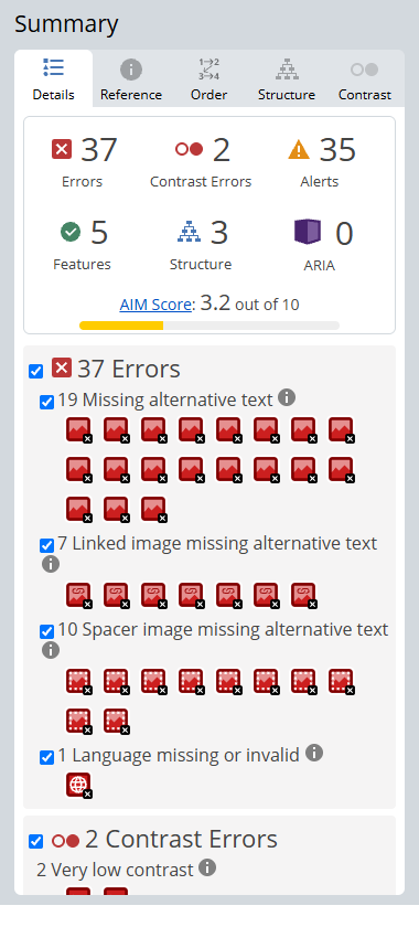
The honest limit: a clean checker score doesn’t mean your site is accessible. A checker can’t tell if your alt text makes sense or if a real person can finish your form.
A full audit goes further. It usually pairs scanners such as axe DevTools and WAVE with manual checks using a keyboard and the NVDA and VoiceOver screen readers, plus a contrast checker. The manual checks take the most time, so the number of forms and templates matters more than the page count.
Forms, menus and pop-ups: where small-business sites fail most
Forms, menus and pop-ups are where small-business sites fail most, because they come from plugins and widgets nobody tested with a keyboard. They’re also where your leads come in. There are 3 places to look first.
- Forms. Placeholder text instead of a label. Errors shown only in red. A puzzle CAPTCHA on a login form, which can fail 3.3.8 (Accessible Authentication, new in 2.2).
- Menus. A hamburger icon with no name, so a screen reader just says “button”. Dropdowns that open only on mouse hover.
- Pop-ups. Newsletter pop-ups and cookie banners that can’t be closed with Escape. Chat widgets that cover the “Send” button.
Common examples: form fields with placeholder text and no labels, a mobile menu button with no name, and a cookie banner that traps the keyboard. The menu one is easy to miss because it looks fine on screen.
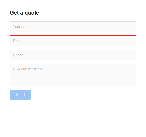
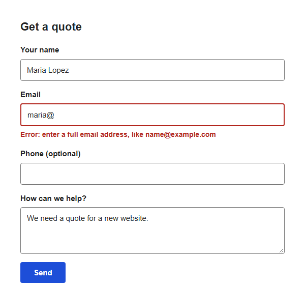 An example form before and after the fix: visible labels above each field, and the error written in text next to the field instead of shown by color alone.
PDFs, videos and images
PDFs, videos and images need a text alternative for every image, captions for every video, and documents a screen reader can read. There are 3 rules to follow.
- Images. Say in a sentence what the image is there to say: “Our crew installing a heat pump in a basement”. A decorative swirl gets empty alt text so screen readers skip it. A logo that links home gets “Home”.
- Videos. Prerecorded video needs captions (1.2.2, A), and audio description where the picture carries information the audio doesn’t (1.2.5, AA). Auto-captions are a start; read them through and fix names and numbers.
- PDFs. A scanned PDF is a picture of text, so a screen reader hears nothing. Put your menu, price list or intake form on a web page instead; it works better on a phone too. If it must stay a PDF, export it tagged, with headings and alt text set.
Do accessibility overlays make a site compliant?
No. An overlay, the widget that adds an accessibility toolbar to your site, doesn’t fix the code underneath. W3C’s guidance says automated tools “can not determine accessibility” and human judgment is required.
The Federal Trade Commission went further. On April 22, 2025 it approved a final order requiring accessiBe, an overlay vendor, to pay $1 million. The FTC had alleged that its claim that the widget could make any website WCAG-compliant was false, misleading or unsubstantiated.
Screen reader users already have their own settings. What they need is labeled forms, real buttons and sensible headings, and only a fix in the code gives them that.
What to do if you get a demand letter
If you get a demand letter about your website, talk to a lawyer before you reply, pay or change anything public. This isn’t legal advice, and we can’t judge how strong a claim is. We can help with the technical side, so you arrive at the lawyer’s office prepared. There are 3 things to bring.
- Where you are now. Run the 30-minute test above and save the results with the date.
- A remediation plan. A simple table: each issue, the WCAG criterion, the fix, who does it and by when. Forms, menus and anything that blocks a booking or a purchase go first.
- An accessibility statement. A page that names your target (WCAG 2.2 AA), what isn’t fixed yet, how people can reach you if something doesn’t work, and the date. W3C has a free generator.
Don’t claim “fully compliant” unless a full audit backs it up.
Keeping it compliant
Keeping it compliant takes 3 habits, because your site keeps changing after the fix.
- Check new content as you publish. Alt text on every image, headings in order, link text that makes sense on its own (“click here” doesn’t).
- Retest after plugin and theme updates. An update to a form or slider plugin can undo a fix, so tab through your contact form after each one. On our website maintenance services, updates are tried on a staging copy before they touch your live site.
- Run the full checklist once a year, and after any redesign.
A checklist tells you what to look for. Fixing it in the theme, the forms and the content is the work behind ada website compliance, and it’s what we do.
FAQ
Is my small business website required to be ADA compliant?
Yes, if your business is open to the public, according to the DOJ’s web guidance, which says those businesses must make their websites accessible. The DOJ hasn’t set a technical standard for business websites, so most owners work to WCAG 2.2 AA. How the law applies to your business is a question for a lawyer. This isn’t legal advice.
Is WCAG 2.2 the law?
No. WCAG 2.2 is a W3C standard, not a law. The ADA doesn’t name it for business websites. The DOJ’s 2024 rule for state and local governments uses WCAG 2.1 AA, and the DOJ’s guidance points businesses to WCAG as helpful guidance. We work to 2.2 AA because it’s the current version and covers 2.1 AA.
Do accessibility widgets work?
No, not on their own. A widget can add a toolbar, but it doesn’t fix unlabeled forms, broken menus or missing captions in your site’s code. In 2025 the FTC ordered one overlay vendor to pay $1 million over claims its widget made sites WCAG-compliant. Fix the underlying issues first; a widget adds little after that.
How much does an accessibility fix cost?
It depends on how many pages and templates you have, how your forms and menus are built, and how many PDFs and videos need work. Fixing one template fixes every page built on it, so a brochure site with one form costs far less than a store with hundreds of product pages. We quote after a first look at your site, because scope depends on the number of templates, forms and documents.
Can I check my site for free?
Yes. W3C’s Easy Checks, the free WAVE checker, Lighthouse in Chrome and the free NVDA screen reader will find a lot, and so will 10 minutes with just your keyboard. Free tools can’t judge whether your alt text, labels and error messages make sense to a person. That takes a human review.
What if my business has no physical store?
Ask a lawyer, because we can’t give you a firm answer and neither can a checklist. ADA.gov’s guidance talks about businesses open to the public and doesn’t separate online-only businesses from ones with a storefront. In practice, customers with disabilities use your site either way, and the fixes on this list are the same.
Want a second pair of eyes?
Most owners don’t have an afternoon for a screen reader. Tell us what’s eating your time and send us your site. We’ll run the checklist on it and tell you what we’d fix first.

Ahsan Shahid, CEO
Ahsan spent 12+ years as a lead developer on Drupal and WordPress projects before building the team behind Tech Artisans, and still reviews the technical work on client projects.
More about us