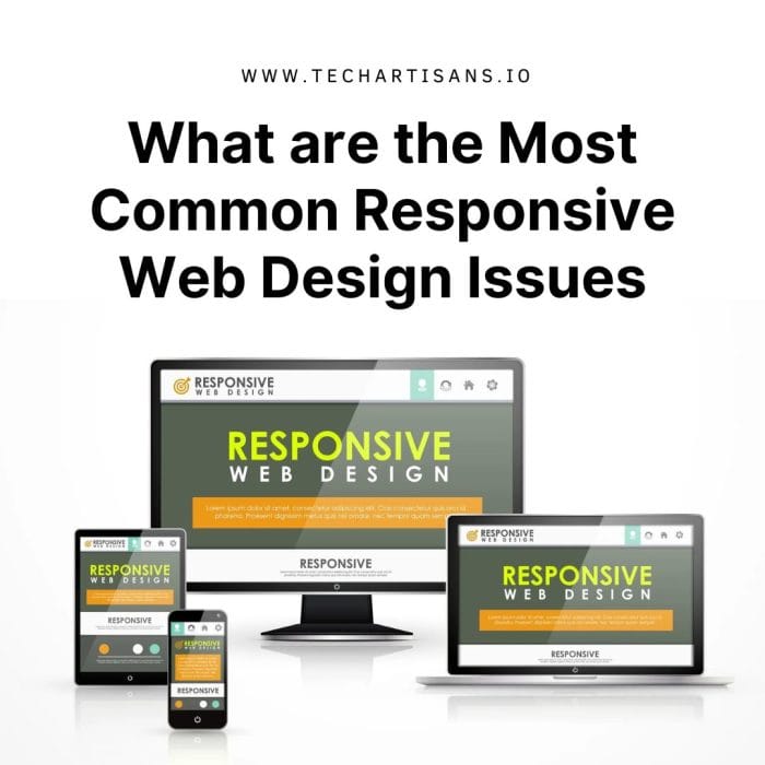
In an increasingly multi-device world, Responsive Web Design (RWD) is essential for a successful online strategy. It ensures your website looks and functions well on all devices. RWD adapts to various screen sizes, providing a seamless experience. Despite its benefits, there are common issues in responsive web design that need attention for a better user experience.
What are the Most Common Responsive Web Design Issues
The most common responsive web design issues often revolve around inconsistent user experience and design inefficiencies. These challenges, if left unchecked, could hinder your website’s performance and user engagement.
Navigation Challenges
Navigational issues pose one of the most prevalent challenges in responsive web design. Ensuring a seamless, intuitive navigation structure that remains consistent across various devices is no easy task, but is essential for enhancing user engagement and ease of use. Let’s delve into the common navigation problems and their potential solutions.
Complexity of Responsive Navigation Menus
Creating responsive navigation menus is complex because they must adapt to various screen sizes and orientations. Desktop menus often have dropdowns, while mobile menus need simplified designs like hamburger menus. Finding the right balance between functionality and user experience is the main challenge, ensuring critical elements are accessible on all devices.
Importance of Intuitive Navigation On Small Devices
User-friendly navigation is vital on small screens, where simplicity and speed matter. Complex navigation leads to excessive scrolling and frustration. With limited screen space on mobile devices, an efficient navigation system makes the most of it, ensuring users quickly find what they need. It’s a cornerstone of successful responsive web design.
Varied Device Viewports
Catering to a multitude of screen resolutions and sizes, from smartphones to large desktop monitors, requires a flexible and adaptable design strategy. Let’s explore how varied device viewports can disrupt the user experience and how to address these issues effectively.
Issues Arising From Different Device Viewports
Different device sizes create responsive web design challenges. Layouts may look crowded on small screens but empty on larger ones. Scaling images properly is crucial; oversized images slow load times on mobile, while small ones appear pixelated on large screens. Solutions involve fluid and adaptable designs to maintain aesthetics and functionality across all screen sizes.
Offer Solutions for Flexible Layouts
Use relative units like percentages, ems, or rems, not fixed pixels, for flexible layouts. Elements scale proportionally, maintaining their size and position on different screens. For example, setting a container’s width to 100% spans the full-screen width, while text in ems or rems scales relative to parent or root elements. Combined with CSS media queries, this approach ensures a responsive web design for an optimal user experience on all devices.
Browser Compatibility
Browser compatibility represents another crucial aspect to consider when addressing responsive web design issues. It involves ensuring that your website’s layout, functionality, and performance are consistent across different browsers, providing a uniform user experience.
Problems with Older Browsers and Responsive Designs
Older web browsers face challenges with modern responsive design since they don’t fully support newer web technologies. This can result in layout problems, style issues, and non-functioning features. Some responsive design techniques using new CSS properties may not work in older browsers, causing variations in appearance and behavior. To make websites compatible, developers use methods like polyfills, conditional loading, or graceful degradation, but these can make the design process more complex.
Suggest Fixes
To enhance compatibility with older browsers, you can consider using polyfills, which are JavaScript code pieces that add modern functionality to browsers lacking native support. Another option is conditional stylesheets, which apply specific CSS based on conditions like the browser type or version. These approaches can help adapt your design for older browsers, but it’s essential to implement them thoughtfully to maintain a clean codebase.
Page Loading Speed
Page loading speed is a vital consideration in responsive web design, significantly affecting user satisfaction, bounce rates, and even SEO performance. It’s important to understand how to optimize your website’s loading speed to provide a seamless experience across all devices.
How Responsive Design Impact Page Loading Times
Responsive design can affect page loading speed. A well-optimized approach ensures faster loading on all devices, enhancing the user experience. However, poor optimization may lead to slower load times, especially on mobile devices, as they receive the same content as desktops.
Conditional Loading As a Solution to Improve Speed
Conditional loading represents an efficient solution to improve page loading speed. It works by only loading the necessary content for a specific device, rather than loading all content regardless of the device’s capabilities and screen size. This way, smaller devices with limited processing power and slower internet speeds aren’t burdened with unnecessary high-resolution images or heavy scripts.
Data Table Responsiveness
Data table responsiveness is a crucial component of any responsive web design, particularly for business websites that handle large amounts of data. Ensuring your data tables are fully responsive is pivotal for a seamless user experience across various screen sizes and devices.
Difficulty in Displaying Complex Data on Small Screens
Displaying complex data tables on small screens is a tough challenge in responsive design. The intricate data can be challenging to present effectively, and simply reducing the table’s size can lead to illegibility and a poor user experience. Responsibly scaling down tables for small devices while maintaining data integrity requires careful design to balance information preservation and readability across all devices.
Solutions for Creating Responsive Tables
There are effective strategies for responsive tables. “Stacking” reorganizes table data into blocks for smaller screens, preserving clarity. “Horizontal scrolling” allows users to scroll through tables sideways, ideal for those with many columns. “Tabular data display” can replace tables with charts for easier data interpretation on small screens. Each strategy has its advantages, enhancing web design responsiveness.
Hiding and Showing Elements
In the realm of responsive web design, the practice of hiding and showing elements plays an essential role in enhancing the website’s usability and aesthetic appeal across diverse devices. This section will delve into the intricacies of this technique, discussing potential challenges and providing actionable solutions.
Use of CSS to Manage Content Visibility Across Devices
Cascading Style Sheets (CSS) allow for the management of content visibility across various devices. They are instrumental in defining the layout of web pages, including the visibility of certain elements. Using media queries, one can hide or show parts of the website depending on the device’s screen size.
Role of Media Queries in Responsive Design
Media queries play an integral role in responsive web design. They are a feature of CSS that enables designers to apply specific styles depending on the device’s characteristics, such as its screen size or orientation. By specifying different style rules for different conditions, a single website can have multiple layouts that automatically adapt to the viewing environment.
Responsive Images and Icons
Responsive images and icons form the backbone of any successful responsive web design, contributing significantly to the overall aesthetics and user experience. Their adaptability to various screen sizes and resolutions ensures visual consistency and clarity, making them an essential component in the arsenal of web designers.
Importance of Scaling Images and Icons for Different Devices
Scaling images and icons correctly for various devices is crucial to maintaining a consistent user experience and preventing disjointed pages. Poorly scaled images can slow down load times, particularly on mobile devices. Proper scaling ensures faster loading and improved user satisfaction.
CSS Techniques for Responsive Imagery
CSS provides effective techniques for responsive images. Using max-width: 100%; allows images to scale down without scaling up, ensuring smooth responsiveness as the browser window changes. CSS3s vw and vh units, likewidth: 100vw;, adapting image width to the viewport size. Additionally, the object-fit property offers methods like fill, contain, or cover to maintain the aspect ratio and dimensions in a responsive design.
Touchscreen Readiness
Ensuring touchscreen readiness is a paramount aspect of responsive web design in today’s mobile-oriented world. This section will explore how to optimize designs for touch interfaces, enhancing ease of use and overall user experience across various devices.
Need for Touch-friendly Design Elements
In the mobile era, touch-friendly design is essential. Many users browse on touch devices, so your website must accommodate them. Ensure buttons, links, and forms are fingertip-friendly. Avoid relying on hover effects, as they don’t work well with touchscreens. Opt for visible cues and straightforward navigation. This makes your site more accessible and user-friendly on all platforms.
Design Tips for Enhancing Touch Interaction
To enhance touch interaction, prioritize the size and spacing of your buttons and links. Make them large enough for users to accurately tap without misclicks. Incorporate enough spacing between elements to avoid accidental selections. Also, streamline your navigation menu, making it straightforward and easy to use even on smaller screens.
Transitioning to Responsive Design
Transitioning to a responsive design is a strategic move that enables businesses to provide an optimal user experience across a multitude of platforms, thereby fostering enhanced user engagement and business growth.
Transition of An Existing Website To a Responsive Design
Transitioning an existing website to a responsive design involves a strategic and technical overhaul. It necessitates redesigning the website layout, implementing fluid grids, and incorporating flexible images and CSS media queries. The ultimate goal is to create a seamless user experience across all devices, enhancing accessibility and engagement.
Tools and Frameworks That Can Aid In the Process
There are numerous tools and frameworks available that can simplify the transition to a responsive design.
Bootstrap is a widely used open-source toolkit that provides ready-to-use components and a responsive grid system. It allows you to quickly prototype your ideas or build your entire app with Sass variables and mixins, a responsive grid system, extensive prebuilt components, and powerful plugins built on jQuery.
The Foundation is a family of responsive front-end frameworks that make it easy to design beautiful responsive websites, apps, and emails that look incredible on any device. Foundation provides HTML and CSS UI components, templates, and code snippets, including typography, forms, buttons, navigation, and other interface elements, as well as optional JavaScript extensions.
Adobe Dreamweaver is a proprietary web development tool that offers a robust and integrated solution to design, develop, and publish projects for any screen size. With features like the visual CSS designer and the ability to adjust layouts visually, Dreamweaver makes responsive design a breeze.
Testing and Quality Assurance
Quality assurance and rigorous testing are vital steps in the lifecycle of responsive web design, ensuring that the design functions optimally across different devices and browsers, and provides users with a seamless and engaging experience.
Importance of Thorough Testing Across Devices
Thorough testing across various devices is crucial in responsive web design. It verifies the design’s adaptability and performance on different screen sizes, browsers, and operating systems. This assessment ensures a consistent user experience, reducing the chances of responsiveness issues and enhancing overall user satisfaction.
Tools and Strategies for Responsive Testing
Several tools and strategies can aid in responsive testing. Google’s Mobile-Friendly Test is a free tool that allows you to check the mobile-friendliness of your website. It also offers improvement suggestions. Responsive Design Checker is another tool that shows how your website appears on various devices.
When testing, adopt a device-agnostic approach, meaning your website should work on any device, irrespective of the screen size or operating system. Also, consider User-Experience Testing. This involves reviewing your website from a user’s perspective, ensuring the layout, images, and fonts adjust properly to different screens. Lastly, Test Automation tools like Selenium or TestComplete can speed up the testing process, especially for larger websites.
Conclusion
In the dynamic digital landscape, overcoming the challenges of responsive web design is not just a matter of preference, but a business necessity. An investment in a robustly implemented responsive design translates to an enhanced user experience, improved SEO, and higher conversion rates. This commitment to adaptability and user-friendliness can significantly elevate your brand’s digital presence, and ensure that your website is not just a static digital brochure, but a powerful tool that drives business growth.


