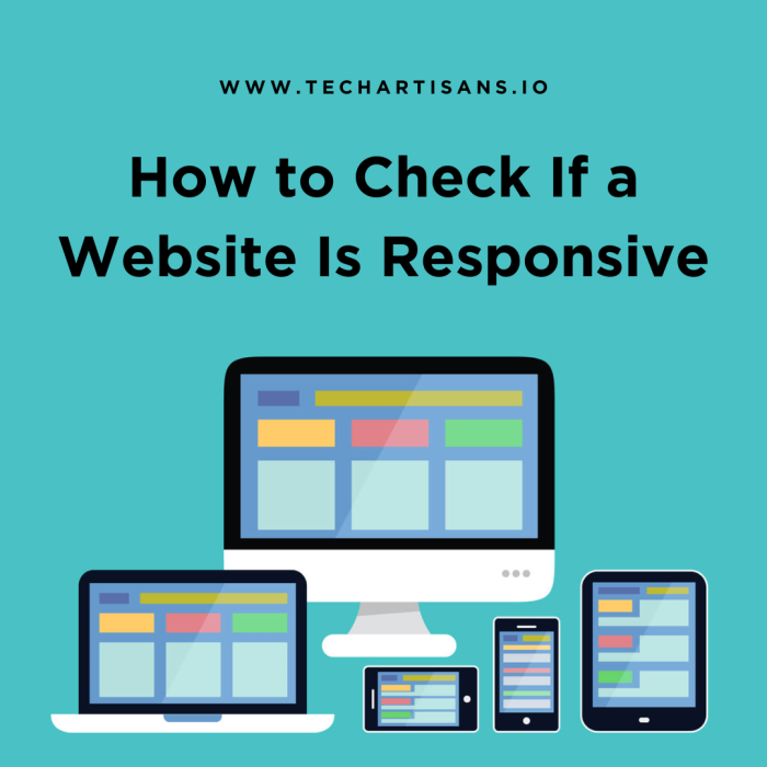
In the digital world, a responsive web design is crucial for business success. It ensures your site works well on all devices, improving the user experience and potentially increasing traffic. It’s like having a store with entrances for all customers. But how can you check if a website is responsive? Here’s how.
How to Check If a Website Is Responsive
Checking if a website is responsive involves testing its adaptability across different devices, screen sizes, and orientations to ensure an optimal and consistent user experience.
Understanding Responsive vs. Adaptive Design
Before we delve into how to check if a website is responsive, it’s crucial to understand the difference between responsive and adaptive web design. Both approaches aim to optimize user experience across various devices, but they do so in distinct ways that can significantly impact your website’s performance and accessibility.
Adaptive vs. Responsive Design
Adaptive design tailors the layout to specific device types. When a user visits an adaptive website, the website detects the type of device and delivers the predefined layout for that device. This method ensures an optimal display but requires more work as you must create layouts for each device type.
On the other hand, responsive web design is fluid and adjusts itself to fit any screen size. It uses a flexible grid to rearrange and resize elements according to the device screen. This flexibility makes it a preferred method as it guarantees a consistent user experience across multiple devices, regardless of screen size.
Importance of Responsive Design for User Experience and SEO
Responsive web design is crucial for two key reasons, User experience and SEO rankings.
From a user’s perspective, a responsive website provides a seamless experience, regardless of the device they’re using. Elements resize and rearrange themselves to fit the screen, preventing awkward scrolling or zooming. This adaptability can significantly enhance user engagement and overall satisfaction.
From an SEO perspective, search engines like Google prioritize responsive websites in their rankings. By having a responsive design, you increase your chances of appearing higher in search results, ultimately driving more organic traffic to your website.
Visual Inspection Methods
Visual inspection serves as a basic yet effective initial step in assessing your website’s responsiveness. This straightforward method involves manually checking how your website appears and functions across different devices and screen sizes. Let’s delve into how you can conduct a visual inspection to ensure your website’s design is truly responsive.
Manual Resizing of the Browser Window
Manual resizing of the browser window is a simple technique to evaluate your site’s responsive design. By dragging the edges of your browser window inward and outward, you can observe how your website elements adjust to different screen widths. A responsive website will fluidly resize and rearrange its content to accommodate the changing viewport.
Mobile Devices to Check for Visual Responsiveness
Check visual responsiveness by using mobile devices. Access your website on smartphones and tablets, and see how it adapts to different screen sizes. If elements are resized and repositioned for usability and aesthetics, your site likely has a responsive design.
Using Developer Tools
Developer tools, integrated into most modern web browsers, provide a more advanced method to thoroughly evaluate the responsiveness of your website. They simulate various devices and screen sizes, enabling you to meticulously test your responsive web design and ensure optimal functionality across all platforms.
Using Browser Dev Tools for Device Simulation
To use browser developer tools for testing responsiveness:
Open your website in a browser like Google Chrome.
Right-click and choose “Inspect” to open developer tools.
Click the “Toggle device toolbar” icon in the top left.
Simulate various devices, screen sizes, and orientations from the dropdown or manually adjust resolutions.
Refresh the page after selecting a device to check responsiveness across platforms.
Importance of Checking CSS Media Queries
To ensure full responsiveness.
Use CSS media queries to apply different styles based on device characteristics.
Test queries for factors like screen resolution, device orientation, and window size.
Ensure styles are correctly applied for a seamless user experience and better SEO rankings.
Online Tools for Responsiveness Testing
In addition to visual inspection and developer tools, various online resources can assist you in assessing the responsiveness of your website. These web-based tools offer an easy, reliable, and comprehensive way to verify that your website delivers a consistent and user-friendly experience across multiple devices and screen sizes.
Google’s Mobile-Friendly Test
Google’s Mobile-Friendly Test is a powerful tool in the arsenal of responsive web design testing. This user-friendly tool gives you insights into how Google’s bots perceive your website on mobile devices. All you need to do is enter your website’s URL, and the tool will analyze it, providing a detailed report. The report includes a screenshot of how your page appears on mobile devices and identifies any usability issues.
Features of Online Tools In Creative Bloq Article
Other tools mentioned in the Creative Bloq article include Am I Responsive and Responsive Design Checker. Am I Responsive provides a quick visual overview of your website’s responsiveness on standard devices? Responsive Design Checker allows custom screen dimension inputs, offering more testing flexibility, especially for unusual viewport sizes.
Testing on Real Devices
Testing your website on real devices is the final and arguably the most crucial step toward ensuring a truly responsive web design. By directly engaging with your site on various devices, you can experience first-hand how users interact with your website, revealing any potential usability issues that may not be apparent in simulated environments.
Benefits of Testing on Actual Hardware
Testing on actual hardware provides the most authentic user experience, exposing potential interface issues and bugs that simulations may miss. It allows for real-time assessment of your website’s performance and responsiveness across different devices, screen sizes, and operating systems.
Services that Allow Access to a Range of Devices
Certain services, such as BrowserStack and LambdaTest, provide access to a range of real devices for testing purposes. These platforms offer a comprehensive selection of browsers and operating systems, enabling you to conduct thorough testing across numerous devices.
Local Server Testing
Local Server Testing is a crucial phase in assessing the responsiveness of your web design. This process allows you to test your website in a server environment mirroring the live site, enabling you to detect and rectify any issues before the website goes public.
Setting Up Local Server Testing
The process of testing a responsive web design on a local server begins with setting up your local environment. This involves installing the necessary software and ensuring that your local server is appropriately configured to host your website. Once this is done, you can start testing your website’s responsiveness directly from your local server.
Using BrowserStack for Local Testing
BrowserStack, a cloud-based testing platform, includes Local Testing, which allows you to test private servers and public URLs for website responsiveness. Establish a secure connection to access over 2000 real devices and desktop browsers for testing.
Evaluating Test Results
Once you have your tests running on BrowserStack, evaluate the results. Pay close attention to how your website renders on different devices and browsers. These tangible insights will help you make necessary adjustments to ensure an optimal responsive design, thereby improving the user experience.
Common Issues in Responsive Designs
Even with the best planning and implementation, common issues can emerge in responsive web designs that can potentially affect your website’s performance and user experience. Let’s delve into some of these challenges and discuss how they can be addressed effectively.
Typical Problems In Responsive Designs
Common issues in responsive web design include inconsistent layouts, slow loading times due to improper image optimization, complex navigation on smaller screens, and unplayable content like Flash on unsupported devices.
Offer Basic Troubleshooting Tips for Common Issues
To fix inconsistent layouts, validate your CSS and HTML code and use a grid system for alignment. For slow loading times, implement responsive images. Simplify navigation with a hamburger or drop-down menu for mobile devices. Use universal formats like HTML5 to make content playable on all devices.
Conclusion
As a business owner, it’s crucial to regularly check and update your website’s responsive web design to provide a seamless browsing experience across all devices. This not only improves your website’s user experience but also boosts its performance, leading to increased customer satisfaction and potentially higher conversion rates. Therefore, invest some time in understanding how to check if a website is responsive and make it a regular part of your business’s online strategy.


