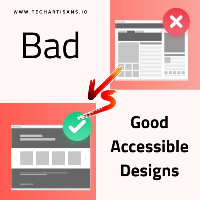
There are many types and choices for website UX design to choose from, which might make it hard to pick the best one for your business. Yet, all website designers must think about one important thing: making sure it’s user-friendly and everyone can use their website easily and key bad vs good accessible designs features.
What is Web Accessibility?
Accessibility means making a website easy for everyone to use. A successful website needs to be accessible because more people will visit it. When designing a website, there are lots of accessibility features to think about to make it accessible. One big thing is the content on the website for screen readers. If you use the right coding and web design tricks, the website will be easy for web users to navigate, even if they have disabilities.
The Web Content Accessibility Guidelines (WCAG) are rules for website makers to ensure their websites work well for everyone, not just a disabled person. There are three levels: A, AA, and AAA (AAA is the best). This article won’t dive deep into the levels but will help you know what not to do and what to do right. By the end, you’ll have great tips for accessible websites.
What Is a Bad Accessible Design?
There are lots of websites on the internet that forget about making their sites easy to use for everyone. Some website owners might not even know about this. But there are ways to make a website hard to use. Here are some examples of things to avoid for the user’s benefit:
- Using Flash animations
- Making pictures into links
- Too much-underlined text content too much
- Using too many colors
- Not making sure if colors work well together
- Not adding captions
- Not describing images
- Not organizing headings clearly
- Using hard-to-read fonts
- Using only pictures without any words
- Not having any accessible content
- Making the font size too small to read
Bad web design and user interface can annoy everyone, but they’re especially tough and have bad accessibility effects for people with disabilities. For instance, someone who can’t see might use a tool to read the website out loud. If the website has ads or videos that aren’t set up right, the tool can’t read them.
Some websites try tricky tactics to fool search engines by cramming keywords into places like alt text and other elements. Alt text is there to describe images for people who can’t see. It helps blind folks understand what’s on the page. However, some marketers found that if they put keywords in the alt text, their site ranks higher on Google. Instead of helping people, they just want more search visitors. This way of using alt text is not right and is unfair.
What Is a Good Accessible Design?
A design that’s easy for everyone to use is a good accessible design. It’s based on universal design principles, making things that work for all people, no matter their age or abilities.
A good accessible design is also one that’s carefully checked. The design is tested to make sure colors and fonts are clear, and that nothing stops other elements of the website from being used easily.
What makes a great design that’s easy for everyone, meets accessibility needs and works for users benefit? It’s the little things. For example, a good accessible website explains images with words for people who can’t see. It also has different ways to move around for folks who listen to the screen.
Another example is when a design can work on many screen sizes. This is important because people use lots of different devices, and they all show things a bit differently.
How to Make It Better?
1. Color Contrast Ratio
Color contrast ratio is really important as it helps text content stand out and be easily readable. Don’t forget about colors. Too many colors can be overwhelming and might make visitors leave sooner.
Bad color contrast ratio makes text hard to read for users with visual disabilities like low vision and color blindness, and even for many users with good vision.
2. Label Forms Clearly and Provide Feedback For Errors
Some websites forget to give labels to their forms. That confuses screen readers. And don’t just put random words on forms – that’s worse. Also, when people make mistakes in forms, let them know what’s wrong. Like when you’re told about password rules: “Make your password at least eight characters long and include…”
3. Simple and Easy Navigation and Keyboard Accessible
This is a really important part of any website. Have a simple menu at the top that stays even when you go to other pages. This helps visitors find their way. Remember, some people use only their keyboard and other assistive technology to move around, so make sure they can do that on your site.
4. Heading Hierarchy

When you use headings, use them in order like h1, h2, h3, and so on. And the headings should tell people what’s coming next. If it’s about a game, don’t start talking about movies. Keep it on track!
5. Responsiveness/ Fit for Any Device
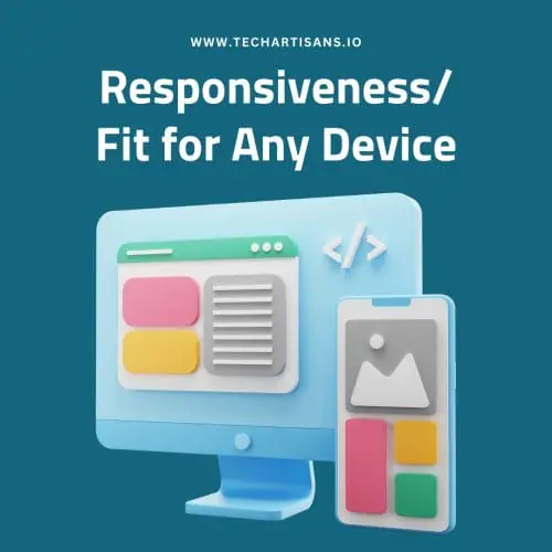
Even if lots of websites are already made to work on all devices, some still mess up on mobiles. When you design, think in percentages, not just fixed sizes.
6. Use Alt Text
When you add videos or images to your website, add captions or explain it with words above or below. This helps everyone, including people with certain cognitive disabilities and visual impairments, to understand and access your content.
If you want an image you can click on instead of text, add “aria-label.” It’s like a label for the screen reader. Put the words you want the screen reader to say in there. This is better than just the alt attribute.
7. No Visible Focus and Illogical Tab Order
Think about people who use keyboard navigation to move around your website. Make sure they understand what’s on your page. When they click on something, browsers should show where they are. Here are some rules:
- When you can use the keyboard, show where you are on the page. (2.4.7 Focus Visible)
- The order things get highlighted should make sense. (2.4.3 Focus Order)
Conclusion
Making an inclusive design that is fully easy to use for everyone can be tough if you do it manually because there are very few examples and lots of rules. When you try to follow some rules, you might accidentally mess up others. That’s why many people use automatic checkers to follow the rules. It can be done in a few days and you don’t need to do much.
But if you’re patient and have time to include these rules in your design process, you can make your website fully easy to use. If you follow the WCAG guidelines properly, your website will be great in every way and ensure optimal experience for potential customers. A website that follows the rules is simple to use and works for everyone, even if they’re older or have disabilities.

