Ever been stuck with one of those DIY furniture puzzles? It’s like a maze, right? The instructions are full of weird drawings and words that feel like a secret code. And don’t even get me started on when the holes don’t match up with the screws or parts are MIA. Total head-scratcher and mood-killer.
But here’s the deal–making things better is all about fixing the user flow. Not sure what that means? No worries, we’re gonna break it down and share some tips to make your journey smooth as butter. Let’s get into the nitty-gritty of how to improve your design process with user flows.
- Understanding User Flow
- The Significance of User Flow in Digital Design Process
- Mapping User Flow Diagrams
- Guidelines for Optimal User Flow
- Strategies for Improve User Flow
What is a User Flow?

A user flow represents a friendly map that shows you the easiest route to get stuff done. It can be a picture or even something on a screen – like a drawing or a fancy illustration on a computer.
Imagine you’re on a quest, and this treasure map shows you exactly where to go. Businesses use these maps to make sure you succeed and to stop you from getting confused or giving up when you’re at the start point. It’s like having a superhero buddy helping you find the treasure, making sure you don’t get lost along the way.
The Significance of User Flow in Digital Design Process

Imagine you’re in a world of DIY furniture – you know, those companies that sell you pieces to build on your own? Well, here’s the scoop: These guys have a golden chance to make things even better by spicing up their user flow. How? Picture this – they could hook you up with super easy video instructions, step by step. These videos could live in a special corner of their website, ready to jump in whenever you need them, day or night.
So, when you’re scratching your head, these videos swoop in like superheroes to save the day. They could even throw in some FAQs to steer you to the right design team if something’s missing. User flow is like that friend who always knows what you need before you even ask. It’s all about giving you solutions before you hit any roadblocks.
Most businesses use diagrams to fine-tune their user flows. This visual representation breaks down what you gotta do and shows you how things fit together with products and services.
Now we will dig deeper into these excellent diagrams in the next round.
Mapping User Flow Diagrams

User flow diagrams are like treasure maps for making customers super stoked. They’re basically blueprints that show you where to sprinkle the magic dust and make user experiences awesome.
Picture it: You’re breaking down the task flow or steps users take while using a product or service. It’s like revealing the secret spots where you can jump into and make things super easy for the users.
Now, here’s where the various shapes come in – they’re like emojis for diagrams:
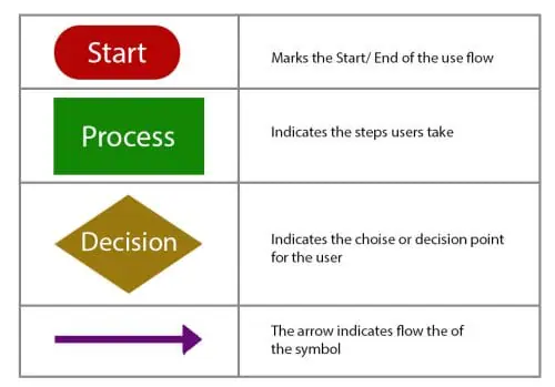
- Rounded Rectangle: Start and finish line. Yep, it’s the journey’s bookends.
- Diamond: These are the game-changing moments where choices gotta be made for the story to move forward.
- Rectangle: These are the play-by-play steps that keep the flow going.
These diagrams show you all sorts of new ways customers groove with your product. They might even uncover moves you never even thought of before. Plus, they’re like a safety net, making sure everything’s working smoothly before you go live.
So, as you dive into creating your own user flow, keep these tips in your back pocket for a design that’s as clear as day and super on-point.
8 Tips for Optimal User Flow

1. User-Centric Design to Craft an Intuitive User Flow
First up, put on your customer hat! We’re talking about stepping into their shoes and thinking about the things that might trip them up. Imagine you’re helping a newbie navigate through this – what challenges could pop up, and how can you save the day?
Now everyone has their own way of solving problems. So, when you’re drawing out your user flow, make sure to plot multiple paths to success.
If you’re scratching your head, no worries. We’ve got your back with some questions to guide you:
- Ultimate Goal: What’s the user trying to achieve with this cool product?
- What’s Driving Them: What’s the secret sauce that’s pushing them to go after those goals?
- Product Power: How can your awesome product be the superhero that helps them reach those goals?
- Trouble Spots: What could throw a wrench in their smooth sailing with your product?
Got these answers? Awesome! You’re on your way to building a user flow that’s like a perfect match for your users’ dreams and desires.
2. User Personas To Picture Your Audience for Enhanced Design

We’re about to dive into something pretty rad called a user persona. Think of it as this cool imaginary buddy that represents your dream audience.
This persona isn’t just a random character; it’s got all the juicy deets about what your peeps are into, what they can’t stand, what are their pain points and what they absolutely need from your product or service.
Also, take into consideration their age, gender, where they’re at, and even how much cash they’re pulling in.
When you picture this typical customer in your mind, it’s like having a secret code to make your diagram user-friendly. It’s like creating a roadmap that’s custom-built for your ideal customers, making sure they’ll totally vibe with your stuff.
Plus, it’s like a reminder to stay focused on who you’re making your product for. You’re basically speaking their language and giving them exactly what they need according to their pain points.
3. Comprehensive User Journey Maps
User’s Journey Map is your backstage pass to a clear understanding of how real users interact with your product or website. Think of it as a roadmap showing what people do step by step when they’re using your product. But guess what? It’s not just task flow– it’s also about the feelings and thoughts that come along for the ride.
These maps point out the big moments – like the star-studded scenes in a movie. These points are the places where the good stuff happens.
4. Entry Point-Centric User Journey Mapping

Creating a user journey map is like opening the first page of an epic adventure book. There’s a whole lot more to this story. We’re diving deep into those entry points that people use to step into your world – your website or product. It’s like uncovering the secret codes to how they’re hanging out with your stuff.
User paths are all over the place depending on when, where, and how people jump into your business.
Think about it: someone cruising in through direct traffic takes a different route sliding in through organic keywords.
Each entry point tells a tale about the person coming through the door. There’s the seasoned pros who keep coming back for more and the wide-eyed rookies who are just getting started.
To make everyone happy, you gotta whip up solutions that cater to both groups. When you understand and respect these different interests, you’re on the road to creating user experiences that’ll knock their socks off.
5. User Flow Analysis and Design Process with Outlines

A simple text version of your detailed user flow is like a secret weapon against errors. First things first, looking through words is way easier than decoding a fancy diagram. Plus, when you roll with an outline, you’re zooming in on what really matters – the heart of your diagram – instead of fussing over how it looks.
You have to be all about user-friendly vibes, not just flashy designs. That’s the real deal when it comes to making your diagram pack a punch. Think of the outline as your trusty sidekick. It’s like a GPS for adding or ditching stuff while keeping the core structure on point.
6. Iterative Design
You’ve got this amazing design idea in your head but getting it down on paper isn’t always a walk in the park. Sometimes it turns into a mess of crazy complexity or leaves you scratching your head, wondering what you were even going for. No worries though, that’s why you’ve got to try out different ways before locking it in.
Once you’ve got that winning outfit, go ahead and throw on some colors, pics, and fancy visuals. It’s like adding accessories to jazz up your style. And hey, if it takes a few tries to find that perfect combo, no biggie! It’s totally normal to do a bit of experimenting before you find the one that makes you go, “Yeah, that’s it!”
7. Engaging UX Design User Flow Diagrams With Shapes, Colors and Pictures

Once you’ve got your design locked in, it’s time to let those creative vibes flow. You’ve got a whole palette of shapes, graphics, pics, and symbols at your fingertips for the best UX design user flow. They’re pretty tempting. But hang on a sec, don’t go overboard! Too much of a good thing can totally throw users off track from your diagram’s main gig.
Here’s the hack: Keep it cool, keep it simple. Stick to a clean, minimalist design. Toss in extra stuff only if it’s totally gonna help or make things crystal clear. Striking that sweet balance means your diagrams become these awesome attention magnets that also teach users a thing or two.
8. Putting Your User Flow to the Test

Now that you’ve wrapped up your UX design user flow, it’s time to give it a spin. Your test group is people who will like your product. Show them your diagram and let them play around with its task flow.
While they’re at it, don’t hold back on asking for their feedback. Are there actions that feel like overkill, or spots where the prototype is missing some juicy instructions? Maybe a user takes it in a completely different way than what you originally expected. These are the kinds of gems your test users can dish out, steering you to create user flows that are all about the users.
How to Improve User Flow?

1. Keep Users Engaged
Ever been stuck waiting for a slow-loading page? It’s a total mood killer for users and can even send them packing or ditching their shopping carts.
To dodge this bullet, you can make things better by fine-tuning those images, cutting down on fancy plugins, and giving caching techniques a whirl for an easy screen flow. This wizardry leads to a super smooth user experience that keeps folks hooked and stoked to breeze through your user flow without any pesky interruptions.
2. Spice Up User Journeys with Personal Touches

Personalization is the secret sauce to make users feel right at home when going through task flow. Instead of throwing the same old stuff at everyone, you can totally use user data to serve up content, suggestions, and even sweet deals for user needs.
3. Keep Things Flowing Across Platforms

If you want to make users’ lives easier, you must keep things steady across different platforms and screen flow smoothly. It’s like having a chill playlist that works seamlessly from your earbuds to the big speakers at home.
You can totally do this dance whether you’re moving from mobile apps to desktop, or app to website. You can use a login portal. It allows users to jump right back into where they left behind.
Also, you can use QR codes. Put one of those codes on real-world stuff, and users can scan it like a pro to pick up right where they left off online.
Wrapping it Up
Testing and fine-tuning are the best ways to make your user flow shine. It’s all about watching how users move through your creation. Conduct a/b tests, throw in some surveys, and bust out some eye-tracking wizardry. This stuff gives you the lowdown on how users are interacting with your basic flow.
Once you’ve got the deets, you’re on the road to superhero status. Those insights? They’re like treasure maps pointing out spots that need some extra love. Armed with this goldmine, you can make super-intelligent changes that are backed by data, turning your user flow into a lean, mean, super-effective machine.

