The website redesign process is cyclical, occurring every 4-5 years. It is pivotal for site owners to redesign their websites to enhance user experience, traffic, and conversions. If you’ve recently undertaken or are planning a redesign, you’re on the right track. However, without the expertise of an experienced design company, you might encounter issues like malfunctioning web pages, decreased site performance, visual glitches, and the common woe – ‘Traffic-Drop’.
This article delves into essential strategies for your redesign team to avert post-redesign traffic pitfalls. If you’re in the research phase, explore our comprehensive article on website redesign.
The Phenomenon of Traffic Drop After a Website Redesign
No matter how awesome your website looked when you first launched it, you’ve got to stay in the loop with the times. Every year, website design trends evolve, just like your competitors’ sites and what users expect, as we explore in our discussion on the most popular web design trends. That’s why we keep saying that website redesigns are the name of the game.
This goes double for those of you who went the DIY or freelancer route. New businesses often start with a shoestring budget and opt for these options. But once the traffic starts rolling in, it’s redesign time. Every site eventually hits a point where it needs a facelift, whether its algorithm changes, shifts in user behavior, or whatever else the digital universe throws at it. So, if you haven’t thought about a redesign, you better get yourself a top-notch WordPress web design crew at Tech Artisans.
When done right, a redesign can supercharge your online game. But here’s the kicker: sometimes, expectations crash into reality. Instead of a traffic boost, some folks see their numbers drop faster than a clumsy juggler’s balls. Suddenly, search rankings plummet, and website conversions vanish into thin air.
How do you dodge this disaster?
It’s all about figuring out what changes could mess up your SEO mojo or trip up those search engine bots. If those bots don’t play nice with your site, Google and other search engines won’t get what you’re about, which is why understanding how to build website architecture is crucial. That’s a one-way ticket to the bottom of the search engine results.
So, if your site’s in the same sinking boat, stick around. We’re diving into why websites take traffic nosedives after redesigns and how to swerve away from these issues.
Reasons Why Website Traffic Declines After a Website Redesign?
Before we dive into how to dodge those pesky traffic drops post a website redesign, let’s quickly break down why these drops happen in the first place. If you’ve been running a website for a while, you’ll know that traffic turbulence is a pretty regular ride in the wild world of the web, especially in the fierce battleground of SEO where everyone’s scraping to be the top dog in the search results.
When you give your site a makeover, expect a dip in traffic at the start. This is like your new website’s way of saying ‘Hey Google, check out my fresh threads!’ The search engine needs a moment to re-index and get you back in the game. If your traffic only dipped a tad (less than 10%) in the first week, no need to hit the panic button – chances are Google’s just doing its crawl dance. You see, Google sends out its bots to dance through every nook and cranny of your site before it struts your stuff to potential visitors.
It’s like a backstage pass before your site goes live again. So, a bit of a traffic hiccup is natural – don’t sweat it. But, if a few weeks have waltzed by, and your Google analytics are still singing the sad song of decreased traffic and lower rankings, it’s time to take action. But before you roll up your sleeves, it’s detective time. You’ve got to figure out what’s causing this traffic tumble post-redesign.
Here are some usual suspects:
1. Impact of Site Architecture
Site architecture is like the backbone of search engine understanding. It’s all about how your web pages are organized and linked up. If you’ve been in the website game for a while, you’ve probably heard whispers about how Google passes on the goods between pages using these internal links.
Where those pages sit in your website’s hierarchy matters too. The closer a web page is to the important pages (like your home page), the more organic traffic it gets. Meanwhile, those buried 3-4 clicks away get a little less love. Now, let’s dive into how giving your site a fresh look can shake up this hierarchy. When you redesign, your new site architecture dances in. And page organization takes center stage. Each web page has its own purpose, and its ranking in search results depends on that.
Especially the pages with a business angle – they need some serious score (link juice) to jive with the big shots in your niche. But here’s where the plot thickens. Your internal links might do the shuffle and become broken links in this website redesign process.
All the important pages might end up with fewer dance partners or the party might be less bumping for other pages that ain’t attracting much attention. If this link value isn’t passed around properly, it’s like a score downgrade for that particular page, and you guessed it – web traffic takes a hit.
Oh, but wait – there’s a trick up our sleeve. Even if you’re juggling site structure like a pro, make sure to whip up a killer sitemap. This is like your website’s treasure map, showing all the good stuff you’ve got. Feed this to the search engine console and watch how Google indexes process sprint.
Oppenheimer Boom, recovery mode engaged, and traffic levels started to rise. If all this tech talk feels like a foreign language, no worries. We’ve got your back. Our SEO and WordPress web design wizards at Tech Artisans are ready to whip your site into shape and kick those drop-in traffic blues to the curb. We have a separate article on Site Structure and how to improve it. Make sure to check it out.
2. The Redirection Riddle
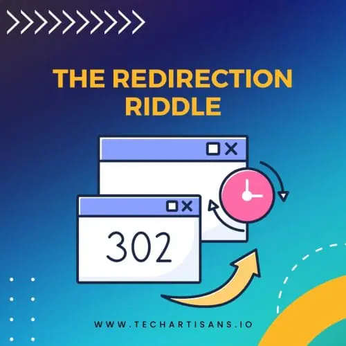
Okay, let’s talk about a sneaky culprit behind your website’s disappearing act – those redirects that didn’t get the memo about being in the right place at the right time. Think of redirects as your website’s GPS, guiding both users and search engines to the new digs. But here’s the twist: if this transition dance isn’t smooth, organic traffic and rankings can nosedive.
Here’s the deal: if you’re keeping the same old web page URL structure, you’re golden – no redirect stress.
But if you’re tweaking even a tiny bit of the website slug, watch out. That little change could pack a punch and lose traffic. So, unless you’re sticking to your old URL like glue, you need proper redirects. These 301 redirects are like the VIP pass that ensures your old page’s rank moves to the fresh page, all while giving Google and other search engines the memo that, “Hey, we’re shuffling things around, but we’re still the same deal.”
Skip this redirection waltz, and the search engine will be stuck in a loop. They’ll treat your new page as an upstart newbie instead of the seasoned veteran it is. And you know the drill – building authority from scratch takes blood, sweat, and SEO magic. So, if you decide to mix things up during your site redesign – new URLs, shuffled pages – without sending the search engines a roadmap, brace yourself for search traffic troubles.
Ready to play detective?
First stop: your Google Search Console, for further insights, check our detailed guide on how to use Google Analytics. Swing by the crawl errors section and hit up the “not found” tab. There, you’ll spot any pages that are AWOL due to lacking redirects.
The fix? Fire up those 301 redirects and get those pages back on the party map.
Hey, if you’ve got the heavy hitters of website design from Tech Artisans on your side, like an experienced company, redirects are their jam. They’ll hash out a solid game plan from the get-go, figuring out which pages need a makeover and which ones are just fine as they are. No small hiccups for your website post-redesign – they’ve got you covered.
3. The Power of Site Copy Changes

Alright, let’s dive into the guts of website redesigns. It’s not just about a fresh look, snazzy colors, and new elements. Sometimes it’s a whole revamp of the words on the page – and we’re not talking grammar tweaks or tiny edits.
We’re talking about a complete overhaul, from top-level topics to nitty-gritty paragraphs. Why do this? Well, it’s all about juicing up that engagement and making your site super tasty for search engines. Think of it as strategically rearranging the pieces on your content chessboard, all backed by data. When your site copy plays nicely with the right keywords, it’s like giving your redesigned website a megaphone in the digital crowd. But here’s where the plot thickens.
When you do this copy shuffle, Google’s got its magnifying glass out. It’s checking if your new content still fits the search queries like a glove. If you’ve tossed out those keywords that were your SEO wingmen, or if they’re lounging in all the wrong places, your ranking’s taking a nosedive. Google’s all about serving users the juiciest answers, and if your content doesn’t cut it, you’re not getting that front-row seat in search results.
Now, hold on to your hats. If your redesigned website copy doesn’t give the keyword love where it counts – title, headers, body, even alt text – your ranking score goes on a nosedive joyride. It’s like showing up to a party without the secret password – no VIP treatment for you. So, here’s the bottom line. When it’s time to redo your website, changing up the copy is like a shiny lure to catch the right visitors.
But here’s the golden nugget: if you’re not a word wizard yourself, bring in the big guns. An experienced SEO agency and WordPress design crew at Tech Artisans can make those changes sing, not sink, as detailed in our article on user experience and SEO. Remember, when it comes to website copy changes, pros bring value that can’t be beaten.
4. Deleted Pages
Alright, so we’ve tackled the big whammies that can kick your website traffic to the curb after a redesign. But there’s another sneaky player on the field: the “Content Gap”. Do you know when you start waving goodbye to old pages on your site? You’re not just giving them the boot, you’re creating gaps in your content lineup. It’s like tossing pieces from a puzzle – suddenly, things don’t quite fit right. Now, hold up. The reason you might be bailing on these pages is to smooth out the user journey.
You’re trying to make it a superhighway with no roadblocks. But, and here’s the twist, if you start chopping all the pages without thinking about the big picture, you’re messing with more than just your site’s flow. You’re creating holes in your content lineup, like missing chapters in a book. And you know what happens when you play content Jenga? The links you’ve earned, the links that brought you street cred, vanish into thin air.
Suddenly, your site’s authority for those keywords takes a nosedive, and ta-da, drop in traffic problems. Think of this like a supercharged version of a copy change. Instead of just shuffling words, you’re rearranging the whole content landscape.
So, before you hit the delete button like a maniac, stop and think. Figure out which keywords and topics are your heavy hitters – the ones that drive the most organic traffic and give you the most bang for your buck. Talk it over with the website design experts before you make a disappearing act. So, we’ve laid out the culprits behind your traffic drop post-website redesign.
Next up, we’re arming you with ways to sidestep these pitfalls and keep that traffic flowing strong.
How to Avoid Traffic Loss After a Website Redesign?

Alright, listen up. It’s like a rite of passage – you get your website a swanky new redesign, and boom, a drop in traffic occurs. But here’s the kicker: it’s not because redesigns are cursed or anything. It’s more like a rookie mistake.
Those fresh-faced websites and businesses sometimes stumble into organic traffic dropped after a website redesign. But hey, don’t let that be your story. If you’re eyeing a website redesign or already in the thick of it, here’s your secret weapon for dodging those traffic loss:
1. Make Temporary URLs
If you’re going for a makeover, consider the layover first. Instead of throwing your site into the wild with all the new stuff, why not give it a practice run? Enter the temporary URL – your ticket to make changes without crashing the party. See, implementing everything live can be like juggling flaming torches – risky for user experience, and, bam, your site might just go MIA. And that’s a surefire way to put a dent in your search traffic and sales. But wait, there’s a genius twist.
The temporary URL lets you serve up your older site design to visitors while you finesse the new one behind the scenes. It’s like having a dress rehearsal before the grand show. You can test site, tweak, and play around without messing with your website’s mojo or sending your SEO on a rollercoaster.
Oh, but we’re not done. While you’re cozying up to that temporary URL, here’s the secret sauce: keep your website copy under wraps. No need to let search engines snoop around just yet. You can slap a “do not enter” sign using a Robot meta tag or seal the deal with a password-protected padlock via your server’s .htaccess file.
And hey, if your site’s rocking WordPress, there are plugins that’ll roll out the red carpet for your users while keeping the search engine bots in check. Now, if you’re ready to tackle a website redesign or want some SEO wizardry, our seasoned SEO and WordPress web design pros are just a click away.
They’ll make sure your website’s ready to strut its stuff on the digital catwalk, as explained in our piece on the web design process.
2. Website Structure

There’s a pitfall that many folks stumble into: messing up the website structure. It’s like decorating your room all fancy but forgetting where you put everything. You know, misplacing your socks with your cereal box – chaos! So, after you’ve played around with your new website on that temporary URL playground, you’re ready to go live, right? Hold up, cowboy. Before you hit that launch button, do a double-check dance.
You want the new version to play nicely with the old structure. Think of it as giving your website’s skeleton a makeover – the bones gotta align. Why’s this a big deal? Well, if you’re willy-nilly with your structure, you’re heading for a double whammy – traffic levels and conversions crumble. So, where’s your focus? Here’s the lowdown on 3-4 points you need to keep an eye on:
And hey, if all this website structure talk sounds like Greek to you, don’t sweat it. Our website design wizards have seen it all. Whether you need a website redesign or you’re struggling with traffic drops, they’re your knights in shining pixels, much like our insights in the web design checklists. Just give ’em a holler.
3. Move Deleted Pages to New URLs or Proper Redirects
Let’s talk about shuffling existing pages in the website deck – it’s like playing a game of digital Tetris. You know, sometimes you gotta move or even remove those pages. But wait up, this isn’t a design party without rules. Making changes to URLs can send shockwaves through your website, and not the good kind. So, let’s break down the moves.
Picture this: you’ve got a star player page, pulling in organic traffic like a champ. You’re thinking, “No way am I deleting or moving this!” But hey, life happens. Sometimes shifting a page to a new URL is the name of the game. Before you freak out about SEO sins, chill. It’s all good – as long as you do it right. So, here’s the move: when you’re booting new pages or giving them new URLs, say hi to your new buddy, the 301 redirect. It’s like magic. It takes the old pages, waves its wand, and poof – new pages, same purpose. Even if you’re giving it a new neighborhood on your site, the page name stays put.
Forget this trick, and you’re tossing users and search engines into a 404 error land. No bueno for SEO tools. But with that 301 magic, you keep your organic traffic, backlinks, and sanity. If someone clicks an old link, they’re not lost in cyberspace, especially when you follow best practices like those in our article on footer design best practices. Nope, they’re smoothly redirected to the new version. Now, here’s the twist: if a page’s mojo’s gone, and you wanna give it the boot, don’t just shoo it to the homepage. Nope, it’s 404 time – that’s your website’s way of saying, “Hey, this page’s gone MIA.” Clean and clear.
Remember, all these URL changes? The backstage show. Do ’em in your staging area before the grand new website debut. That way, when your site’s live, it’s all smooth sailing. And here’s a pro tip: search engine crawlers don’t need to stumble upon your 404s. Keep it structured, and your site’s SEO won’t skip a beat. But hey, if this URL juggling feels like a circus act, don’t stress. Our website design whizzes are ready to roll – whether it’s revamped site or SEO considerations, they’ve got your back.
4. A/B Testing

If your goal is to up your user game and turbocharge conversions, there’s a secret weapon – A/B testing. It’s like test-driving before committing, and it’s a perfect way to avoid traffic drops. So, you’re sprucing up your website to make it super user-friendly and conversion-hungry. Cool beans. Before you go all-in, hit the brakes, and do some A/B testing. This way, you won’t see your rank and traffic doing a disappearing act. Here’s the deal.
If you’re fiddling with small stuff like colors, meta descriptions or CTAs, start by running tests on just one URL.
It’s like a dress rehearsal, where some users see the original page, and others peek at the tweaked version. Magic happens behind the scenes – we’re talking Javascript and DOM manipulation – but what matters is, that Google gets it. It knows you’re just tidying up for your users. Now, to ace this testing game, pick the right tool. There are some slick ones out there that let you craft variations of pages and let your audience pick the one they dig.
Some even let you target specific users. Fancy, huh? Like, if you want only the cool cats who’ve visited before to see your test version, you can make it happen. It’s like giving a sneak peek to your VIP crowd.
Here’s the kicker – you don’t have to go at it alone.
If you’re not feeling the A/B testing groove, call in the big guns – an experienced WordPress website design crew. They’ll whip up a killer design that won’t throw your SEO off balance, as you can see in our guide on effective ways to measure your brand awareness. So, whether you’re a testing guru or just want a pro by your side, you’ve got options.
5. Split URL Testing for Major Changes
If you’re just tweaking a couple of things on your website, the A/B test is your buddy. But hang tight, if you’re planning a grand redesign extravaganza, this might not be your jam. You see, too much tech stuff can slow your site down, and that’s like putting a speed bump on your user experience and even your ranking.
Here’s the scoop: A/B testing is like trying on different outfits before the big party.
Perfect for the small stuff, not so much for the whole wardrobe overhaul. If you’re giving your website a major facelift, here’s a nifty trick – set up a separate URL just for the makeover. Then, send that link to your loyal customers for a sneak peek.
Now, before you go down the testing rabbit hole, here are a couple of pitstops to make:
- Redirection Alert: When you’re sending folks to the test URL, don’t use the heavy-duty 301 redirect. Opt for the more chill 302 redirect. It tells Google, “Hey, this is just temporary, don’t sweat it.” The original URL’s the real deal.
- Stay Original: Avoid copycat troubles. Use a rel=canonical tag to tell Google, “Hey, the real deal’s over here.” It’s like keeping your site’s story straight.
Timing is Everything: Don’t let your tests run wild. Whether it’s split URL or A/B testing, put a time cap on it. Google doesn’t like feeling tricked, so keep it short and sweet. Your testing tool’s got your back, suggesting how long to rock those tests based on your traffic.
Whether you’re dipping your toes into testing waters or diving deep, remember – it’s all about improving without messing up your traffic or SEO mojo. If this testing talk’s got you scratching your head, don’t sweat it. Our website design wizards know the drill, and they’re here to make sure your redesign’s a hit.
6. Pay Attention to Internal Links
Alright, remember how we chatted about the power of internal linking structure earlier? Well, after you’ve sorted out the whole URL relocation and redirect dance, it’s time to give your website’s internal linking a makeover. It’s like tidying up your room after a party – gotta make sure everything’s in its place. So, picture this: you’ve revamped your URLs, and you’ve set up those fancy 301 redirects, but wait up – your links need some love too.
If you’re saying goodbye to a page, make sure its internal links hit the road too. And if you’re redirecting that old page to a new spot, give those internal links a friendly nudge too. But here’s the twist – why bother with changing the URL structure in your links? After all, your old link’s already ushering folks to the new page with a 301 redirect, right? Well, here’s the deal: constant redirects can slow things down and maybe even leak some link juice.
Redirects aren’t all sunshine and rainbows. So, switch it up – update the new URL in your links. It’s like giving your users a direct route instead of making them take a scenic detour. Your website will thank you for it. Tools are your friends here. Use them to sniff out which pages are linked up during your redesign. Adjust your links based on that. Don’t forget about those header and footer menus. Sometimes, a little menu spring cleaning can do wonders. If something’s out of the header, let it shine in the footer.
Quick tips:
- Head Start: Your header menu’s like the VIP lounge – it’s got the heavy hitters. Fill it with links to top pages, and Google will give ’em extra attention.
- Context Matters: If something’s bidding adieu to the header, don’t let it fade away. Nest it in contextual or further links. It’s like keeping old friends close.
- Map the Way: Oh, and your xml sitemap? Keep it in check. We’ll dive deeper into why a pimped-out sitemap’s your SEO BFF soon.
So there you go – navigate your internal linking maze like a pro and watch your website’s traffic get the boost it deserves.
7. Fix Sitemap

Hold up, sitemaps – they can be real sneaky troublemakers for your website’s traffic and ranking. If you’ve been in the website game for a while, you probably know that sitemaps are like your site’s secret sauce for SEO. But don’t panic if you’re scratching your head at this tech talk – we’ve got your back.
So, what’s a sitemap?
Think of it as your website’s blueprint that whispers sweet directions to search engines. These smart bots use your sitemap to figure out your website’s layout and what’s where. Having a rock-solid, updated sitemap can work magic for your SEO rankings.
But guess what?
When you’re all jazzed up about redesigning your website, your outdated sitemap might decide to play makeover too. And if you’re not on top of updating it, your site’s ranking and traffic might pull a disappearing act. Alright, how do you dodge this sitemap trap during a redesign? Simple. Before you hit the launch button, create a spanking new sitemap that lists all your new and old pages.
Keep the original structure like a champ – the linking order and the top-level setup. Lucky for you, there are online tools that can whip up a sitemap in a snap. If you’re rocking WordPress, there’s a nifty sitemap generator plugin too. Once your sitemap’s all set, don’t keep it to yourself. Get it out there in the open – submit it to the likes of Google Search Console and Bing Webmaster Tool.
This turbocharges the search engine’s crawling process. The quicker they find your new site layout, the faster you can wave goodbye to any traffic blues. Got more tech questions? Our SEO strategist has got your back. They’re not just about the techie stuff – they’ll help your website shine and give your online game a boost.
8. Improve Your Website Schema Markup

Hold on, what’s this fancy term? Think of it as your site’s personal dictionary that talks to search engine bots. It’s tucked into your website’s HTML code, making it easier for these bots to get what your content’s shouting about and improve site performance.
Now, if you’re in the middle of a website redesign frenzy, keep your eyes on the schema markup prize. Especially if you’re diving into the code yourself to jazz up your design or add new stuff. See, when you’re doing the manual coding dance, you might accidentally trip over your schema markup and – poof – it’s gone.
Even if you’re just tossing in some new elements, make sure you tag ’em right. Those tags act like a GPS for search engines, guiding them through your content maze. To give your schema markup a quick check-up, try a structured data tool. Paste in the code snippet it dishes out and see what’s what in the new schema template. Hold off if your redesign’s still under wraps – this tool’s for the live version.
Here’s the game plan: Once your site’s live and kicking, roll up those sleeves and dive in.
Do a manual sweep of every nook and cranny, making sure your schema markup’s on point. Google’s coming to the party soon, and you want to make sure it has a blast crawling your site. After the crawl, peek at your schema markup report in your console. If all this techie jargon’s not your jam, no sweat.
Call in the pros – an experienced SEO whiz can help you keep that traffic flowing smooth while improving site’s performance and avoiding common seo errors.
9. Website Content
If you’re gunning for more traffic and conversion, it’s time to give your words a makeover too. But here’s the kicker: tossing in a new design can throw your old content off balance. Yep, that snazzy visual might clash with your trusty words. If your content stumbles, your engagement, and ranking take a nosedive. No worries, though – we’ve got your back.
Here’s the game plan to keep your content on point after a redesign:
a) Word Count Wizardry

Think word count’s just a number? Think again. Sure, fancy visuals jazz up your site, but Google’s all about those words. Don’t yank out thousands of words and replace ’em with eye candy. Trust us, Google bots give high-fives to a text-heavy landing page. Don’t axe the words, hide ’em! Tuck ’em away behind tabs, sliders, or other slick tricks. Keep your service snapshots, just add a “read more” tag to sneak in extra info.
b) Audience Approval
Who knows your content’s charm better than your visitors? Give ’em a taste of different messages through A/B testing. See what floats their boat and what sinks it. If your landing pages are getting a redo, go the extra mile – test the whole shebang. Your site’s mojo could plummet if your new messages don’t tickle the crowd. So, before the full launch, tap into your loyal squad for some real-deal feedback.
c) Content Time Capsule

Here’s the thing – even with all the bells and whistles, your search engine rankings might still do a belly flop.
Gotcha covered: stash your old content away, just in case. If your traffic and ranking play hide-and-seek, swap in your tried-and-true content and see if the magic comes back. Remember, redesigning isn’t a race. One tweak at a time, friend.
Your content’s got to be the superhero for both search engines and the folks visiting your site. Miss a step, and boom – traffic drop, ranking slide, you name it. But hey, if all this tech talk’s not your jam, no sweat.
Call in the big guns – an experienced WordPress web design whiz can craft a fresh look that doesn’t mess up your SEO mojo.
Conclusion
Let’s get real about the traffic drop situation and how to avoid traffic drops on a new website design. Redesigning your outdated website might sound like a breeze, but it’s more complex than a jigsaw puzzle.
Think of it as crafting a new home while keeping the old foundation intact. Throughout this makeover dance to improve the website’s performance, you’ve got to keep SEO in the spotlight. It’s like a tag-team effort – design and SEO holding hands for a traffic and revenue boost.
If you’re slapping in fresh content, it better be buddy-buddy with the right target keywords. And if you’re waving goodbye to a page, guide your users to the new digs. The tiniest slip-up in this creative tango can sucker-punch your SEO.
Here’s the golden rule: don’t go solo on this redesign adventure.
Bring in the pros – a seasoned WordPress website design crew. They’ll weave their magic to make sure your website emerges from the makeover dazzling and trouble-free, akin to the advice we provide on how to choose a web hosting provider. They’ve got the chops to finesse your design, tickle SEO’s fancy, and make your online presence pop. Trust me, it’s a game-changer.

